As part of my teaching and research, I enjoy developing techniques for data intensive visualizations for space and geosciences. This page includes some current projects I am working on.
3D Interactive Mars Space Environments
If you have a low speed internet connection please see the non-interactive panel below.
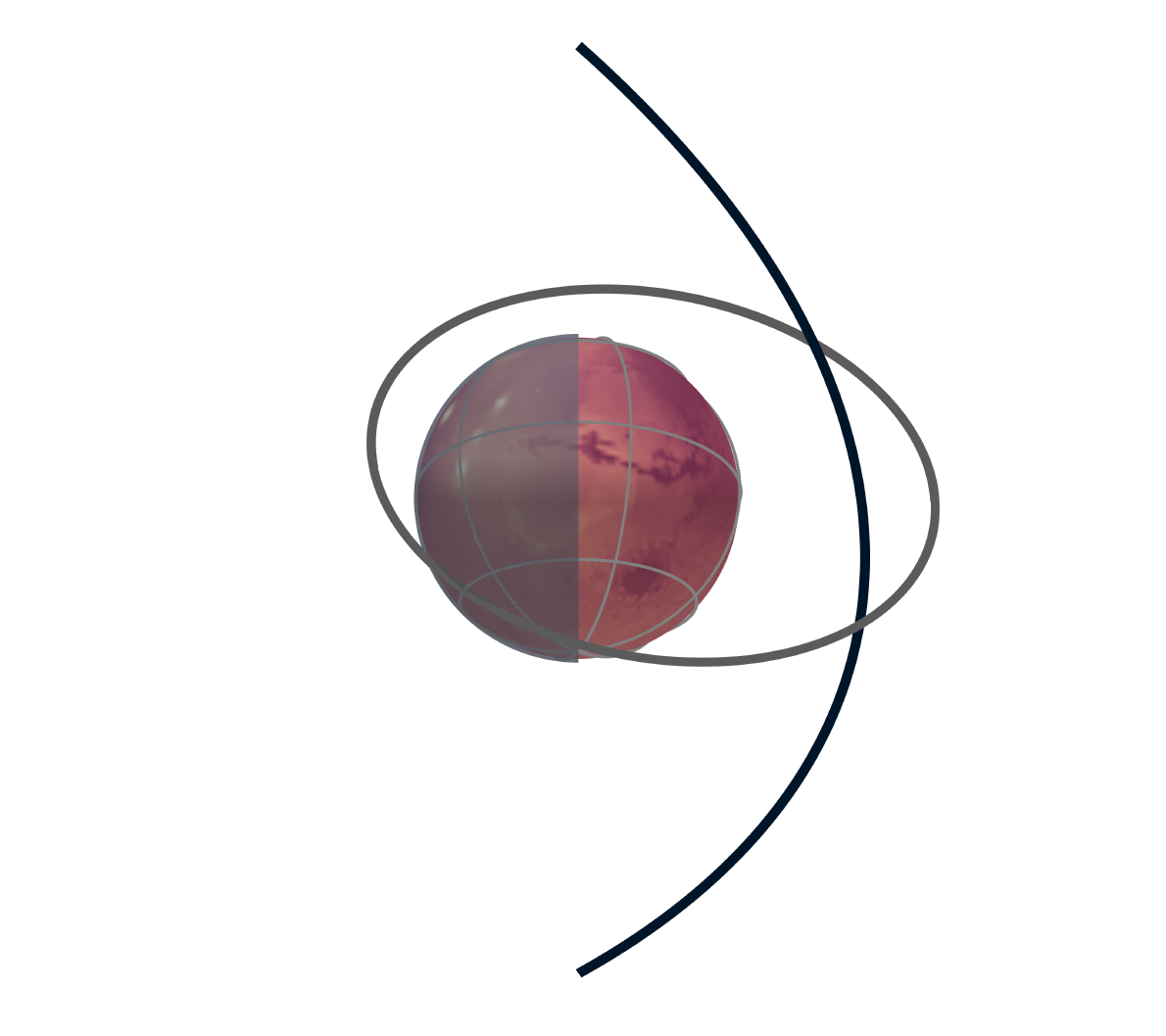
About: This represents an orbit of the MAVEN mission over Mars (grey) and the average bowshock location at noon local time (black) over the dayside. The surface is the elevation as estimated from the Mars Global Surveyor's Mars Orbiter Laser Altimeter instrument. This was the orbital arrangement of the MAVEN spacecraft and planetary orientation on December 27, 2022.
Resources: This interactive Mars is powered by Plotly. The development of this visualization was assisted by material from the Python for Dynamics and Evolution of Earth and Planets and SQLite. The MOLA surface data is described within Zuber et al., 1992. The average bowshock is calculated from Gruesbeck et al., 2018 The rotation of Mars and spacecraft trajectory was calculated with the NASA SPICE toolkit (Acton et al.,1996, 2018).